Vision Plus
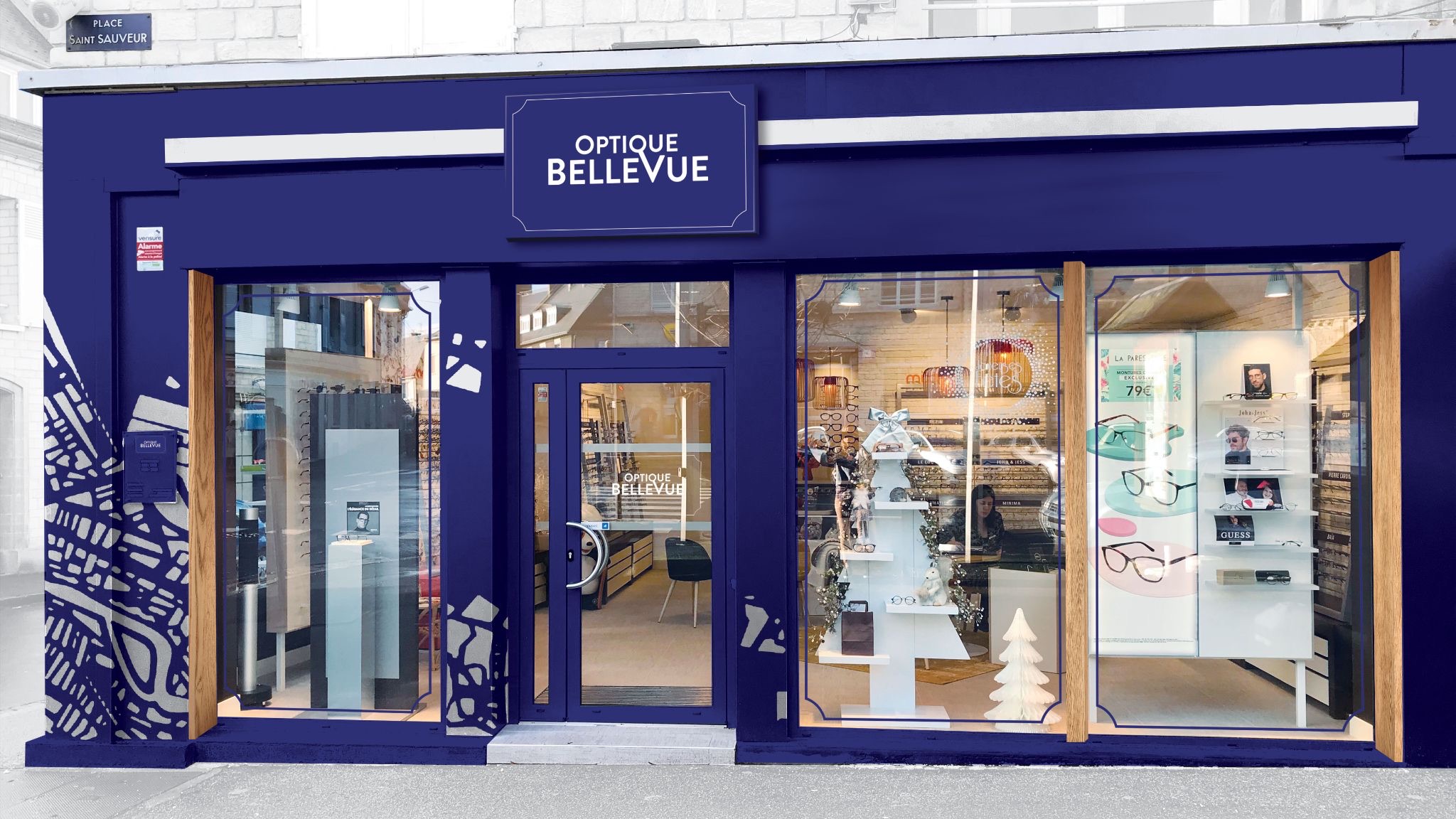
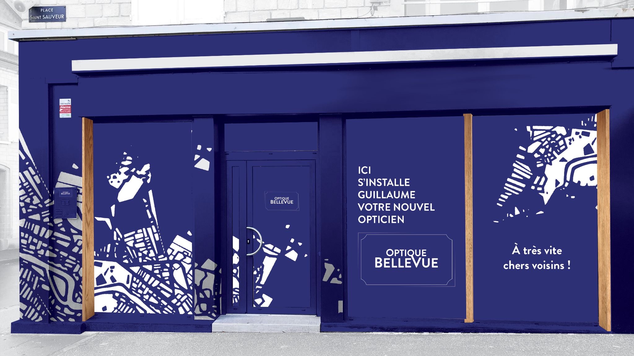
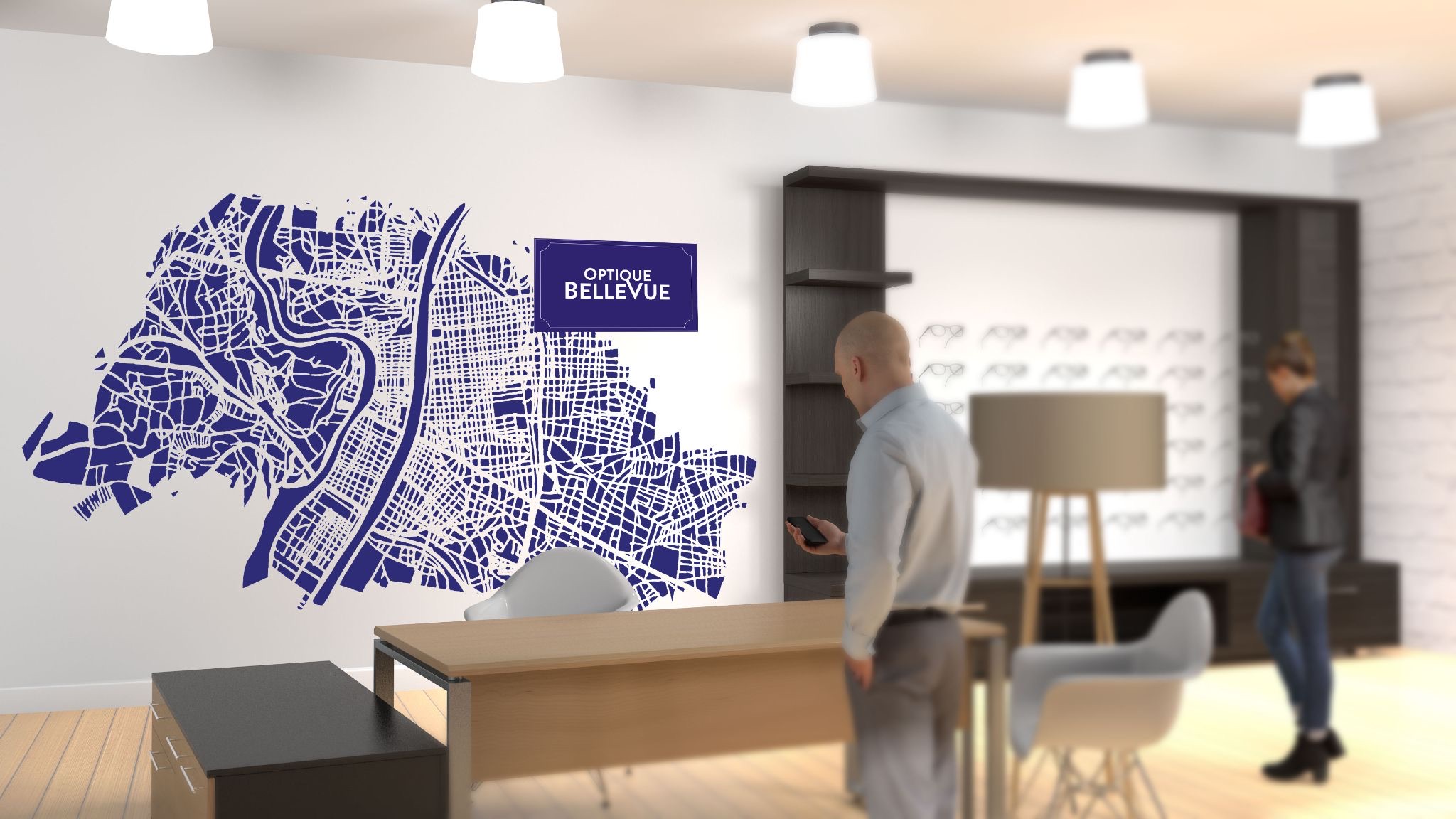
Pour Vision Plus, l'enjeu était de faire sentir à chaque client qu'il n'entrait pas dans une enseigne nationale — il entrait chez un opticien de quartier. Pour un ancrage local fort, c'est le plan du quartier qui a été utilisé comme pattern. La nouvelle charte a suivi la même logique : appliquée en façade et en vitrine avec une vraie cohérence, mais suffisamment vivante pour s'adapter sans perdre son caractère.
For Vision Plus, the brief came down to one thing: making sure customers didn't feel like they were walking into a chain. They were walking into a neighborhood optician. To anchor that locally, the area's street map became the interior pattern. The new brand guidelines followed the same logic: consistent enough to read as a system, loose enough to stay alive across seasons and promotions without losing its character.